Statisticians have developed a remarkably powerful set of tools for analyzing normally distributed data. Too bad real data is never normally distributed. Fortunately for us, most of the time "close enough" is all we really need. But how are we to know? One quick and effective method is a look at a Q-Q plot. Go deeper into data by taking Learning Tree's Fundamentals of Statistics for Data Science Training. The Q's stand for "quantile" in a Q-Q plot.
What is a Q-Q Plot?
Technically speaking, a Q-Q plot compares the distribution of two sets of data. In most cases, a probability plot will be most useful. A probability plot compares the distribution of a data set with a theoretical distribution. For example, the R function `qqnorm()` compares a data set with the theoretical normal distribution. We can start by looking at the mpg column of the familiar `mtcars` sample dataframe.
qqnorm(mtcars$mpg)
qqline(mtcars$mpg, col = "steelblue", lwd = 2)
The `qqline()` function plots a line representing perfect quantile matching. If the distributions matched perfectly, all the quantile points would lie along the blue line. Is the deviation we see here cause for concern? Let's generate some normally distributed random numbers and see how they look on a probability plot.
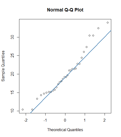
If the distributions matched perfectly, all the quantile points would lie along the blue line. Is the deviation we see here cause for concern?
Make a Q-Q Plot
Let's generate some normally distributed random numbers and see how they look on a probability plot.
dfN1 <- rnorm(1000, mean = 50, sd = 10)
qqnorm(dfN1)
qqline(dfN1, col = "maroon4", lwd = 2)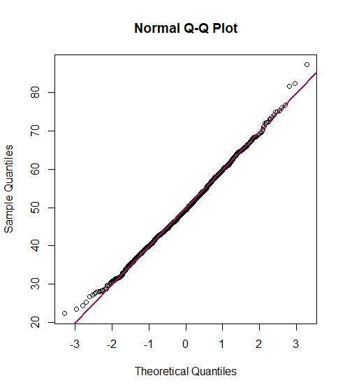
Since a relatively small number of data points in normally distributed data fall in the few highest and few lowest quantiles, we are more likely to see the results of random fluctuations at the extreme ends. We now understand that the `mtcars` mpg data is not precisely normal, but not too far off.
Now let's generate some sample random data that we know not to be normal. We can do this using the `sn` package.
library(sn)
y3 <- dsn(x, xi = 0, omega = 1.2, alpha = 2)
plot(x, y3, type = "l", ylab = "density", col = "royalblue")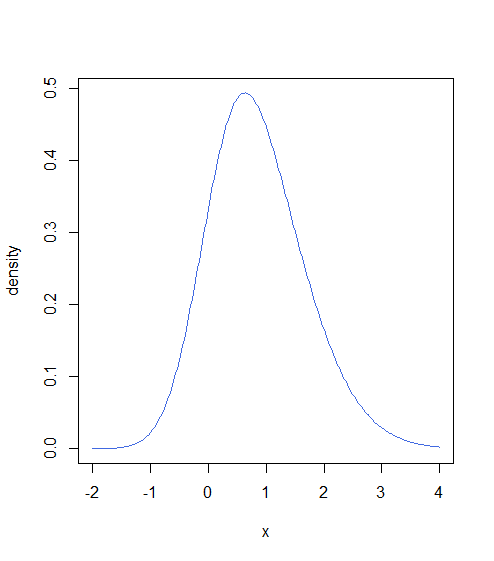
This dataset is not normally distributed, but doesn't look that far off. Let's take a look at the output of `qqnorm()` for this data.
qqnorm(y3)
qqline(y3, col = "dodgerblue4", lwd = 2)
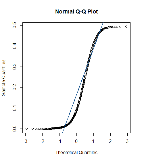
The Q-Q plot clearly shows that the quantile points do not lie on the theoretical normal line. We see that the sample values are generally lower than the normal values for quantiles along the smaller side of the distribution.
A True Q-Q Plot
It is very common to ask if a particular dataset is close to normally distributed, the task for which `qqnorm()` was designed. However, you may wish to compare the distribution of two datasets to see if the distributions are similar without making any further assumptions. R implements the `qqplot()` for this purpose. Unfortunately, since we are not comparing to any theoretical distribution in this case, there is nothing comparable to `qqline()` available in `qqplot()`. We can, however, use `abline()` to draw the same line if we calculate the appropriate intercept and slope.
abline(intercept, slope)
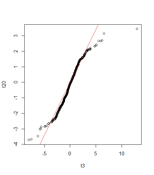
Just out of curiosity, we might compare samples following t-distributions with different values for degrees of freedom.
t20 <- rt(1000, df = 20)
t3 <- rt(1000, df = 3)
qqplot(t3, t20)
abline(0, sd(t20) / sd(t3), col = "firebrick2")
Key Points on Q-Q Plots
- Quantile-Quantile (Q-Q) Plots compare the distribution of two sets of data.
- They are especially useful for comparing a data set to a theoretical distribution, often the standard normal distribution.
- `qqnorm()` Function in R compares data to the theoretical normal distribution and plots a straight line if the quantiles match.
- `qqplot()` Function can compare two data sets directly without assuming a specific theoretical distribution.
- The Q-Q plot visually shows if the points fall along a straight line, indicating that the data follows the theoretical distribution reasonably well.
Data Science Training with Learning Tree
Take your data analysis skills to the next level with Learning Tree’s comprehensive data science training. Learn how to interpret Q-Q plots and other essential data visualization tools to make informed, data-driven decisions.
Conclusion
As is so often the case in data science, well-chosen graphs communicate information more quickly and more understandably. Q-Q plots and probability plots provide quick comparisons between probability distributions and can tell us how closely a data sample is to normally distributed.
Sign up for a course today and start mastering the art and science of data analysis!


